To Beckett, PSA, SCD, et all,
THERE ARE WAY MORE THAN 3 DIFFERENT VERSIONS OF THIS CARD.
There are at least 8 different versions of this card. Let’s say 8 for those who disagree with the minutia often inherent in variation cards, however, truthfully, there are at least 13 distinct versions.
Here we are, some 22 years after it’s discovery (1999 if you take the word of Beckett’s Annual Price Guide editors), 32 years after its release and this card is still causing confusion and trouble. Its origin remains murky as no former Fleer reps have gone on record to explain why this card was changed or why it took Fleer so many different tries to get it right. Even stranger is that this is not a legend’s brother’s second-year card or a journeyman reliever’s card, this is the rookie card of one of the game’s greatest pitchers and yet very little hard info exists on it. And what little info that does is in need of regular updates. It seems that collectors have settled on “Randy didn’t like the sign…” as reason for the changes, however, I am not convinced due to production timeline)
I can’t tell you for certain how many variations exist on this card, because just like it’s more famous relative, 1989 Fleer Bill Ripken #616, new varieties are still being discovered. But it’s safe to say that Fleer altered this card at least 12 different times! I’ve spent more time than you can imagine, squinting at poor-quality scans of this card on ebay over the last 20 years now. I know a lot about the different varieties, or I should say, I thought I knew a lot, but then I met, and began discussing this card, with an avid collector named Kevin, who has compiled an impressive collection of the varieties, including the first known copy featuring a completely-clear Marlboro sign (another copy turned up in late 2019, PSA graded; yet another turned up in September 2021, now also a PSA 9) Kevin’s knowledge as well as the expertise of several collectors on the Net54 forums have helped keep my interest in this variation alive, specifically it’s proper cataloging in the “big books” and with PSA’s registry, in turn (all these years later and still the cataloging and labeling of them is a huge mess full of inconsistent and incorrect information).
Let’s take a look a some of the many, many different varieties available. This article will not cover every version, especially considering how many distinct varieties do not scan well. Plus, I will be updating it with new images and notes on versions not listed here, as they become available. For now, here are the basics:

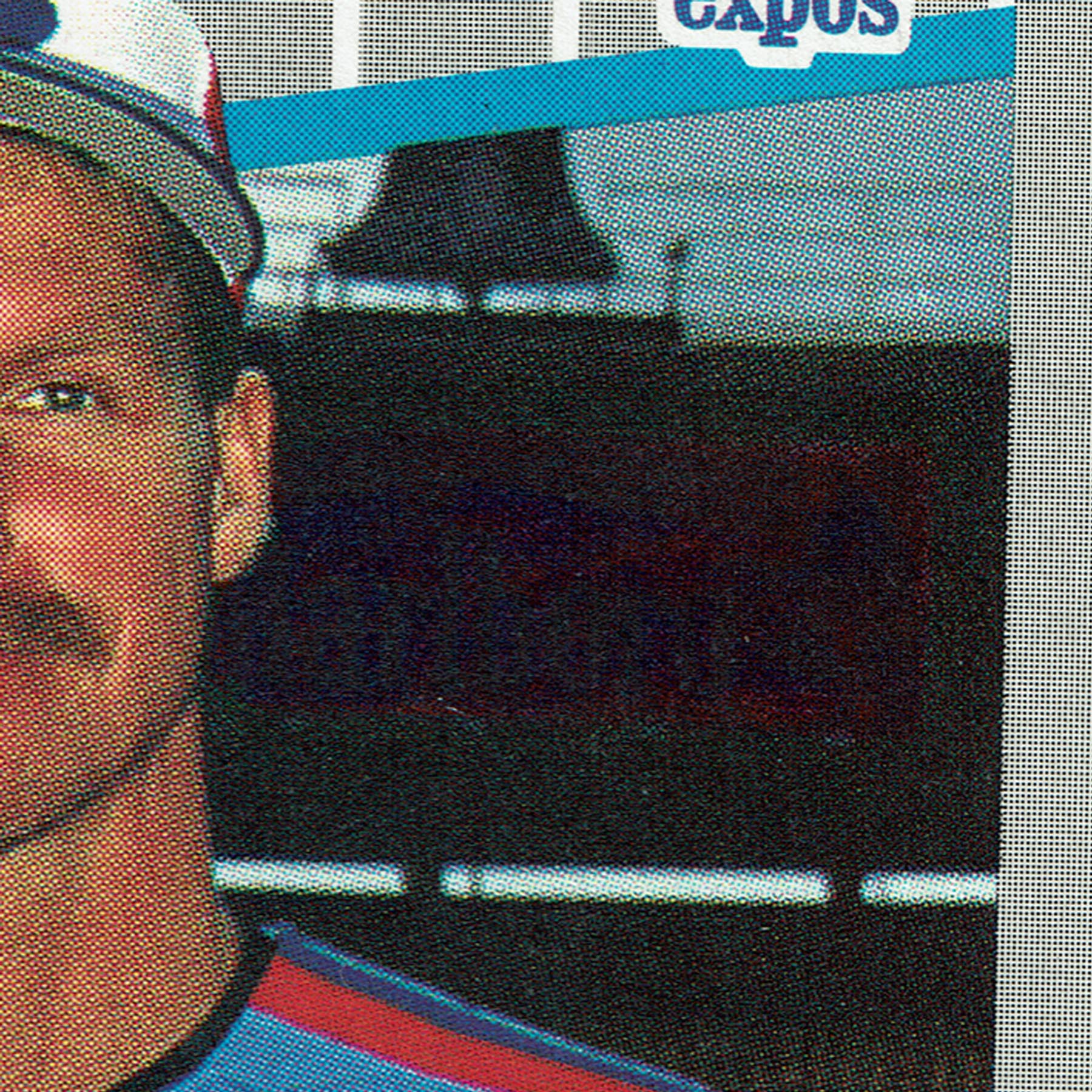
A very close up pic of the “Clear” Marlboro version. For obvious reasons, this is believed to be the first version of card 381 produced. Un-tinted (aside from natural lighting/shadows), unedited and extremely scarce. To date, just three copies have been confirmed. Quite possibly the rarest, pack-issued junk era variation. As it stands, far scarcer than the iconic Frank Thomas NNOF print flaw.

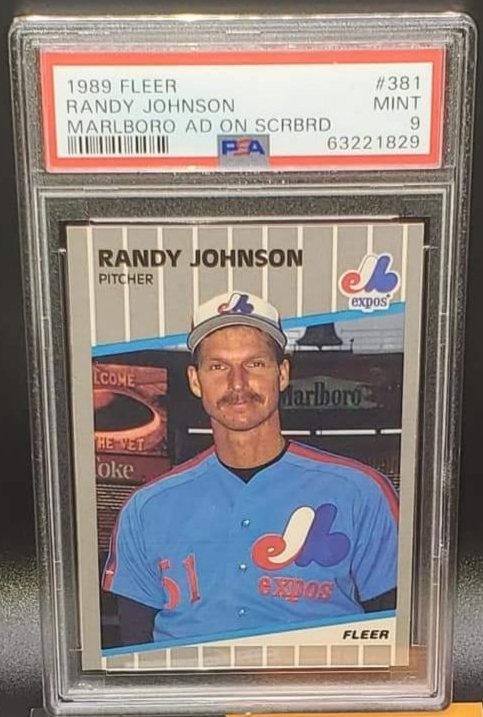
This is typically what get’s labeled, bought and sold as the “Marlboro” or “Ad Visible” version. Long thought that this was among the clearest types out there. Sign is pretty visible, very low levels of green or red tinting (we’ll talk about that later).

As you can see on this “Red Tint” version, the sign has received a darkening effect of some kind. As if a reddish filter was placed over just the sign area. Certain features of the sign, such as the cowboy and lettering appear to be muddled with an even darker red coloring.

One of the rarest and more recent discoveries is the “Blue Tint” version, the sign has received an aqua-colored mask effect of some kind. As if a blue/green filter was placed over just the sign area. Certain features of the sign, such as the cowboy and lettering appear fairly visible still. Note the small amount of stray color on Randy’s ear.

This looks very similar to the previous red tint cards but there are a handful of subtle differences. I’m not 100% sold that this is a completely separate variety than the one listed above but something about the tinting, specifically around the lettering on the sign stands out to me when compared to the above card (especially in person).


And now, things start to get weirder. At some point – or possibly a result of Fleer using multiple printing facilities, Fleer proofers added a very green tint to the sign (note the bubble by the cowboy, especially how you can see the white of the logo – you’ll see the bubble again later…). Like the muddled red versions above, there are varying versions that are similar enough to not warrant their separate cataloging but an understandable challenge for the completest. It should be noted that the green tint varieties are among the tougher to acquire (…may no longer be true?). This type is commonly referred to as the “Green Tint” version.
Again, like the Billy Ripken card, this proves so frustrating that that Fleer decides to crudely scribble over the offending sign:

Probably one of the tougher correction varieties, this appropriately-labeled “Black Scribble” version can be a bear to track down. I’ve seen fewer copies of this type, though many more over the last five+ years than anytime prior, I would guess that this is a short-run, transitional type, much like the “White Scribble” Billy Ripken variation. Note the prominent red still present at the top right of the sign.

An example of a “green tint” variety with the “Black Bar” correction through the Marlboro lettering. Beneath the black ‘bar’ you can see what appears to be a dark red scribble over the word Marlboro, which leads me to believe that this version came after the “Green Scribble” (above).
Here we have an example of the “Negative” or “Stencil” version. In this pic is the red tinted type (a scarce blue tint type was also produced). Notice that the white area of the Marlboro logo is has been recolored a dark red color leaving the greenish-black color of the letters and the cowboy to stand out quite a bit.

One of Fleer’s other tricks was to place a “box” around just the Marlboro logo in the background. I have found that these vary in size and in some cases, you can see the word ‘Marlboro’ through the box with a good light source. This card pictured is a “Green Box” version. The overall tint or color to the box is greenish.

“Red Box” without bubble. Pretty much the same idea as above but using a reddish tone to cover the offending portion of the background. These come in several shades with many minor varieties to them leaving it up to the collector as to whether or not they should be cataloged separately. These are fairly common among the non “Blacked-Out” types.

“Red Box” with “bubble.” There are a handful of differences between this and the card pictured above, most notably the bubble by where the cowboy should be. This bubble shows up on a few of the different correction attempts and is always in the same place. This would suggest that something was obstructing that spot of one of the printing plates even throughout changes to the background! A mysterious little fingerprint left to aid in the unraveling of this card’s production origins.

This card. Not sure what it should labeled. Maybe “Dark Red Box?” I’ve seen fewer of these than either of the above-mentioned “box” varieties. In person, this card looks almost like the final, “Blacked Out” version but it isn’t. An exceptional light source will reveal that it has a triangular black shape over the lettering that looks almost identical to the “Green Scribble.” This version seems to have also cleaned up all those little edges, bubbles and bright spots on the other “box” varieties. A bizarre version that needs further study.

Final corrected version? Nope. While this unusual (and seemingly quite rare) version passes all the light and angle/tilt tests, there is no visible residue of the sign, tints or corrections to it, at first glance this solid blacked-out card appears to be the very common, final version (see below) but it is, in fact, not. Notice the tell tale sign of pre-final correction: the small gap between sign top and Randy’s head.

This is the most common type found. In fact, these have been pulled out of boxes that contain the Bill Ripken “Fuck Face” error, a testament to how quickly all these changes were made to this card. This is the “Blacked Out” version, the final version, using a similar method of correction as card #616 – a full black-out of the offensive area. This is the version most frequently found for sale and it’s also the version that comes out of factory sets (they were produced last).
Hopefully you’ve found this tutorial useful. It is my goal to get these recognized by the big guides and one day come to a final tally on the different variations. *Probably never going to happen*
Remember, even though this card comes from a massively overproduced set, it’s still the rookie card of a future Hall-of-Famer, with 5 Cy Young Awards, a perfect game, a no-hitter, 300+ wins, 4800+ Ks, 10-time All-Star and World Series MVP! I think given the rarity of some of these variations, it’s a no-brainer that Randy’s scarcest RC is found within the 1989 Marlboro varieties. Imagine if Nolan Ryan or even Roger Clemens had 10+ variations of varying rarity affecting their rookie?
UPDATE 8/13:
Just received this today:

This looks especially “blacked-out” around just the lettering of “Marlboro.” At this point, I am unsure if this qualifies for a new, unique variation, but check out this comparison shot next to the 1st version mentioned above, aka, the Marlboro version:


Negative/Stencil ‘Box’ Variation
September 2021 Clear Variation Find

TTM/IP Auto’d Box Variation
UPDATE 5/8/2020; 10/1/2020:
At this point, I think it is safe to say that the order of rarity fluctuates constantly. Versions I used to encounter often ten years ago are hardly seen today plus the addition of several recent discoveries keeps the effort to rank these cards somewhat impossible. Keep in mind that this list are my ’13 categories’ that the thousands of copies I have reviewed fall into with acceptance for some degree of variance in ink and color. I do not count stray dots, fisheyes or any of the print flaw cards that weren’t a result of editors attempting to cover the area:
1.) Clear sign (three known copies to date)
2.) Blue/Aqua tint, very visible MARLBORO
3.) Green scribble B (taller, narrower scribble area)
4.) Green tint, black bar through MARLBORO only
5.) Green scribble A (shorter, wider scribble area)
5.) Light tint, solid black bar through MARLBORO only
6.) Negative/Stencil box (area surrounding MARLBORO blacked out, cowboy and letters greenish)
**Where the blue “stencil” variation fits remains TBD**
7a.) Green Tint A (light tinting, letters visible)
7b.) Green Tint B (dark tinting, letters muddled)
8.) Standard Marlboro version (no red or green tint but visible letters – variations within this variation exist)
9). Red tint (variations exist within this variation)
10.) Blackened sign, gap between Randy’s head and top of sign (typically these cards have a fully blacked out background without a gap between Randy’s head and the top of the sign, this version has recently appeared and is not to be confused with a darkened, red or green box version)
11.) Red box (‘bubble’ variations within exist)
12.) Green box (‘bubble’ variations within exist)
13.) Blackened sign, no gap between Randy’s head and top of sign (common correction)
***Really, who knows…***
FYI, all images in this blog are scans of variations previously owned by me, currently owned by me, contributed by fellow Marlboro enthusiast experts (thank you) and the lone exception being the “Clear Sign” copy. I look forward to posting more varieties as they come into my possession so keep checking back to this article periodically.

Recent Comments